


UNITED WE STAND
State Flag Re-design
Back in 2013 this project went viral. It was discussed throughout the internet, in newspapers, and even on the radio. The project was based on a simple idea, our state flags are poorly designed and it is time for an update.
The reason, I believe, for the interest around this project had to do with an idea that we are still fighting about to this day. Is our country open to change and inclusion or would we rather stick to our old way and in this case, old designs. Personally, I have always interpreted the statement "more perfect" to be a call to action.
Below is the original article that was posted back in 2013.
Year
2013
Role
Creator & Designer
Credits
Media - Caroline Tiger
The Article
United We Stand
Not too long ago I heard a radio piece about a city flag. Curiosity led me down the path to our state flags. I was immediately bothered by how discordant they are as a group, and I wasn’t surprised to learn they break just about every rule of flag design. (More on the official rules of flag design later.) When you look at them all together, there’s no indication they come from the same nation.
Unfortunately this is an accurate representation of where we are right now as a country. We can’t seem to get anything done. But we used to. As a tribute to the collective creativity that brought us this far — and, truth be told, to the “united-ness” I hope we adopt in the future — I embarked on a project to redesign all fifty state flags.
Good Flag Design (Officially)
To begin to create a cohesive group of flags I first stripped away everything (like Civil War symbols) that reminded me of a divided nation. I removed the numbers that indicated a state’s induction into the union. It might sound silly, but I aimed to get rid of anything that could point to rivalry, i.e. who came first.

Current Flags
A Message of Unity
To begin to create a cohesive group of flags I first stripped away everything (like Civil War symbols) that reminded me of a divided nation. I removed the numbers that indicated a state’s induction into the union. It might sound silly, but I aimed to get rid of anything that could point to rivalry, i.e. who came first.

Some flags required a complete overhaul so I created my own symbolism, choosing ones that are decidedly American. The main symbols are the star and the stripe; the secondary symbols are the eagle, olive branch, shield, and Lady Liberty.

Since I wanted the symbolism to be meaningful to each state, I also pulled from unique geography, historical and famous events, and state mottos and symbols. As the design evolved, I noticed a visual language starting to emerge. The color blue represents water or sky. A sideways triangle represents hill and valleys. A standard triangle represents mountains, a sunburst is the sun, and stars became place holders for the states themselves.

GROUNDING THE VISUAL BRAND LANGUAGE
I used color as my unifying branding element. Color is commonly used to signify brand identity — even more than form, color can unite a product with its family. I brightened up the red, white, and blue. (I was okay with the colors being more reminiscent of the French flag than Great Britain’s.)

My second unifying element is proportion. The official American flag is 1 by 1.9. Since we’re a nation made of states, I thought the state flag should be slightly smaller. I chose 1 by 1.5 because of its visually pleasing proportion — it is close to the golden ratio, but standard enough to produce easily.

The Designs
The New Flags


ALABAMA The symbol of Dixie in the middle is surrounded by eight triangles representing the eight Native American tribes who used to live there. The triangles also form a subtle “X” shape, referencing the existing Alabama flag.
ALASKA Very similar to the original’s simple composition featuring the Big Dipper or Great Bear. I changed the colors and highlighted the North Star which also represents the state itself.

ARKANSAS The diamond state with three stars for its three slogans.

ARIZONA Very similar to the original.

CALIFORNIA This is the only flag with curves, because I wanted to convey the feeling of driving along the coastline. The new design is like the old one with the bear reinstated. The Bear Flag Revolt took place in 1846 when a small group of American settlers rebelled against the Mexican government and proclaimed California an independent republic.

COLORADO: This state’s flag is iconic so I didn’t change much, just the colors.

CONNECTICUT I noticed the red-white-red stripes for the flag because they are commonly used on most of the state’s branding, including their official website. I kept the grapevine from the existing flag and seal, because it was an early symbol of prosperity and is believed to represent early individual.

DELAWARE I kept the existing flag’s blue field and diamond, said to represent George Washington’s uniform. In the diamond is a “tall” ship, which speaks to the state’s history of coastal commerce. In the negative space of the sails is the number “1” signifying that Delaware was the first state to ratify the United States Constitution.

FLORIDA: A sun rising over the ocean in the Sunshine State.

GEORGIA I removed the seal, restoring the flag back to its original stars and stripes. The star in the middle represents the state itself.

HAWAII I removed the Union Jack and kept the eight stripes, one for each of eight major islands.
IDAHO There’s a gem in the canton because every type of gemstone is found in Idaho. The red represents the mountains and the blue is the sky.

ILLINOIS Illinois is an Algonquin word that means “warriors” or “tribe of superior men.” To represent the idea of a warrior I used the shield that appears on the current flag. The 13 stripes represent the 13 original colonies. Illinois is also nicknamed the “prairies state” — the red strip on the bottom of the flag is meant to represent the horizon line of a prairie.

INDIANA I simplified the existing Indiana flag by removing everything but the torch of liberty. I adjusted the colors to make them cohesive with the new scheme. The star represents the state itself.

IOWA The only state with rivers on both sides, represented by the stripes. The two stars stand in for the two parts of Iowa’s motto: “Our Liberties We Prize, and Our Rights We Will Maintain.”
KANSAS I kept Kansas simple and used the state flower, the wild sunflower, as the main element. The star in the middle represents the state itself.

KENTUCKY The intertwined arrows represent the joining of the frontiersman (red) and the statesman (blue) who are shaking hands on the existing state steal. That image (illustrating the motto, “United We Stand, Divided We Fall”) also appears on the flag. The angled lines suggest a “K.”

LOUISIANA In 2006 Louisiana’s state legislature passed a bill requiring any depiction of the mother pelican in the state’s flag or seal be accompanied by a depiction of the three drops of blood with which she feeds her young. In my design the white bar on the left represents the mother pelican. The three stars are three drops of blood. The white triangle on the right is the young pelican’s beak.

MAINE The blue triangle in the center is a big pine tree. The pine tree is a symbol of new England, and is on the state’s original flag from 1901. The state motto is “Dirigo,” which is Latin for “I direct,” and the shape of the pine tree in this updated design doubles as an arrow pointing up the path to the future.

MARYLAND The existing flag depicts the coats of arms of the state’s two founding families and is very well-liked. I kept that idea but simplified it and united the symbols.

MASSACHUSETTS The nautical compass represents the first settlers’ landing on Plymouth Rock.

MICHIGAN The white is the peninsula and the rising sun. The shield represents defense, which comes up three times in the current flag. The star symbolize Michigan’s mottos: “Out of Many, One”; “I Will Defend”; and “If You Seek a Pleasant Peninsula, Look Around You.”

MINNESOTA Minnesota is nicknamed the “North Star State” and is also known as “Land of 10,000 Lakes.” The North Star is sitting in the middle of a blue circle which represents the lakes.

MISSISSIPPI I removed the confederate flag from the canton and replaced it with a star representing the state.

MISSOURI The Missouri River (blue stripe) dissects the Till Plains (white). The red is the Ozark Mountains.

MONTANA Montana means “mountains” in Spanish — these form an abstract “M.” The white lines are snow, and the blue field is sky (big sky country).

NEBRASKA The red strip on the bottom half represents the great plains of Nebraska. The blue strip is the sky, and the white triangle represents its hills.

NEVADA The blue stripes represent cooler climates that surround the state and the red bar in the middle represents the desert. The bar also represents a bar of silver, taken from the state’s nickname, “the silver state.”

NEW HAMPSHIRE The flag features two blue strips to represent the two parts of its motto, “Live Free or Die.” In the middle is the profile of the “old man of the mountain,” also known as “Great Stone Face,” which is a potent symbol for New Hampshire. In 2003 it collapsed, and I wanted to commemorate it. The old man of the mountain is made of Conway granite, and New Hampshire is known as the “Granite State.”

NEW JERSEY The state motto is “Liberty and Prosperity.” The shield is liberty, and the arrow — pointing upward — is prosperity.

NEW MEXICO The existing flag’s design is iconic and is one of the best liked state flags so I didn’t change much, just the color.

NEW YORK The Statue of Liberty’s crown has five points for the five states bordering the state and for New York City’s five boroughs. The red and white backwards “L” is a nod to the Union Jack and a reminder of what we can do when we band together.
NORTH CAROLINA The existing flag has a blue vertical rectangle on the left side which represents the bonnie blue flag (unofficial confederate flag). I changed the blue to red, restoring the flag back to its original 1775 state.

NORTH DAKOTA The northern state with sunshine to its south (South Dakota used to be known as the sunshine state). The design visually connects the two states.

OHIO The sideways triangle represents hills and valleys, and the “O” is the buckeye and also “O” for Ohio. I reduced the number of stripes to three because I kept coming across threes in Ohio’s history (ex. admitted to the union in 1803).

OKLAHOMA Oklahoma is based on the Choctaw words, “Olka Humma,” which translate to “red people.” The current flag has preserved the relationship between the Anglos and the Natives with an Osage shield crossed by a peace pipe and an olive branch. I wanted to preserve the idea of this relationship. This design is based on a Parfleche war shield. The points on the symbol represent some of the dominant tribes that Iive in Oklahoma — Cheyenne, Kiowa-Comanche-Apache, Chickasaw, Choctaw, Muskogee (Creek), Cherokee, Osage, and Seminole.

OREGON The red triangle on the left represents the hills of Oregon. The state animal is a beaver.

PENNSYLVANIA A nib of a pen occupies the left-hand side, representing the signing of the Declaration of Independence. Three stars represent the state motto: “Virtue, Liberty and Independence.”

RHODE ISLAND I kept the design close to the original flag but simplified it and stripped away all the stars but one to represent the state itself.

SOUTH CAROLINA I wanted to keep the “Moultrie flag” or “Liberty flag” design that exists in the current flag, but I added the vertical red stripe which relates it to the South Carolina flag I designed earlier.

SOUTH DAKOTA It used to be known as the sunshine state. I also noticed the number two comes up a lot —the slogan has two parts, and the state was founded on November 2nd — so I represented it with two large color fields.

TENNESSEE This is almost identical to the actual state flag.

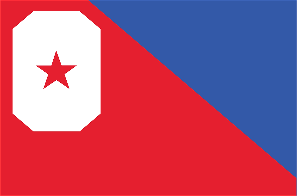
TEXAS: The current flag is iconic and doesn’t need to be changed, but because this is a side project I thought it would be fun to conceptually emphasize the lone star on their flag. The goal is to make it even more iconic by enlarging the star. The red represents the Native Americans who used to live there, and the white represents purity and uprightness (same as Wyoming’s flag).

UTAH Utah’s motto is “Industry” which is commonly represented by a beehive. I used a hexagon to represent the idea of industry since hexagons are a shape commonly found in our modern industry (nuts and bolts) and are also the shape of the cell structure of honeycomb. The hexagon sits in a blue strip which represents the great Salt Lake.

VERMONT I updated the original Green Mountain Boys flag used by the Vermont militia of the 1770s.

VIRGINIA To reference the fact that more presidents have come from this state than from any other I used the stripe ratio that is associated with contemporary presidential campaigns.

WASHINGTON The eagle represents George Washington, and the two stripes reference his coat of arms.

WEST VIRGINIA The diagonal red triangle on the bottom represents the side of a mountain, and the star is a mountaineer. The state motto: “Mountaineers Are Always Free.”

WISCONSIN It borders the Great Lakes, represented by the blue. The arrow suggests the state’s motto: “Forward.”

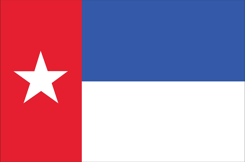
WYOMING For this flag I didn’t need to change much. I just replaced the state seal with a star representing the state itself. The red represents the Native Americans who once lived there, and the white is purity and uprightness (same as the Texas flag).
New State Flags

